Evidence-based guide
What Is Tinting Strength? Compare Two Paints With White
Tinting strength tells you how much a little colored paint changes a mixture. To compare two tubes of the same blue, measure equal portions of each into separate piles of the same white. The blue that carries further into the white has greater tinting strength under those conditions.
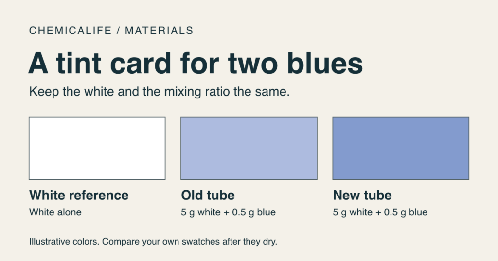
You mix a pale blue for a background. Halfway through, you open a fresh tube of ultramarine, use your usual recipe, and get a noticeably deeper blue. Before changing the whole batch, make two small swatches. They can tell you whether you need a smaller dose from the new tube or a different blue altogether.
Start with the pigment code on the tube
For a strength comparison, choose two acrylic paints labeled with the same single pigment, such as PB29 for ultramarine blue. Write down the product names as well as the codes. A tube labeled “ultramarine hue” might list several pigments; if the recipes differ, the tints may differ in hue as well as strength. You can still compare them for your painting, but the result answers a different question: which mixture gives you the blue you want?
Why use white? A thick dab shows the color the paint makes on its own, often called its masstone. A dark dab can hide differences you will notice as soon as you mix a pale sky. For a controlled comparison, keep the white and the mixing ratio the same. ISO 787-16 describes comparing prepared pigment dispersions with the same white paste under defined conditions. The card below is a practical comparison of finished acrylic paints, not a test performed to that standard.
Make a tint card you can use again
- Label three spaces. Mark a scrap of primed board “white,” “old tube,” and “new tube.” Add the brand and pigment code. Leave room beside both mixtures for a second trial.
- Choose one measuring unit. For example, weigh 5.0 g of the same titanium white into each of two clean containers. Add 0.5 g of the old blue to the first and 0.5 g of the new blue to the second. These example quantities give a 1:10 ratio of colored paint to white by mass. Use a scale that can resolve the smaller portion. Avoid switching between grams and spoonfuls halfway through.
- Make three patches. Set down a patch of the plain white as a reference. Mix each blue and white thoroughly, cleaning the knife between cups. Spread both tints to a similar thickness on the board. Keep the recipes beside the swatches so you can reproduce them later.
- Compare the dry patches side by side. Use the same light for both. First ask which patch looks closer to plain white. Then ask whether one leans greener or more violet. Write these as separate observations before adjusting your recipe.
Your card records the behavior of the finished paints in your recipe. It cannot tell you the percentage of dry pigment in either tube.
Use the result to adjust a recipe
Suppose the new blue gives a deeper patch at 0.5 g, but both patches lean the same way. Keep the white at 5.0 g and try 0.4 g of the new blue beside the original reference. If that dries to the color you want, your working recipe is 0.4 g of new paint per 5.0 g of white. For 50 g of the same white, start with 4 g of the new blue. Keep a little of the white in reserve for a final adjustment. This is an example of scaling a matched recipe, not a measured rating for PB29.
If the lighter trial still looks greener than the reference, adding white alone may never give you the original hue. Keep the swatches and try a closer pigment or formulation before spending more paint. If both tints look nearly white and you can barely distinguish them, repeat with more blue in both cups. Changing only one cup would spoil that comparison.
What if the stronger blue still shows the layer underneath?
The tint card tests what happens in a mixture. To investigate hiding power, brush a separate strip of unmixed paint across adjacent dark and light areas and look for the boundary through the dry film. A blue can shift a whole spoonful of white yet leave that boundary visible in a thin layer. Keep the two observations on separate lines of your card. When you pick a paint for a glaze, the second line matters; when you replace a tube in a pastel recipe, start with the first.
For more ways to compare the materials in a paint film, see the pigment chemistry guide.